New and revisited work is up at The Light Divides and the Story Multiplies, a group show at Associated Artists of Pittsburgh, which opens this Saturday, August 29. The show is curated by Dan Hendrickson and includes work by Christine Holtz, Andy Julo, and Michele Randall. I have prints from two projects in this show. One of them is a revival of photographs from 2020-2023, from the series Where Facilities Exist. These are photographs of individual pieces of discarded plastics, photographed in the style of a cabinet of curiosities.
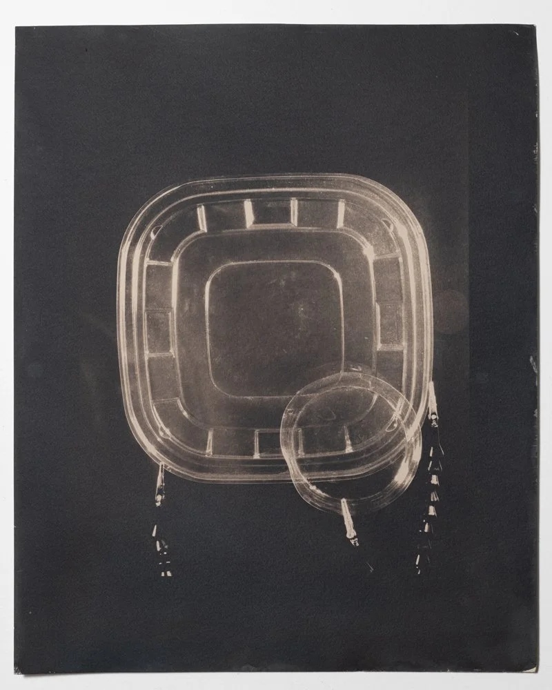
Where Facilities Exist (2437), toned cyanotype, 22” x 30”, 2020/2026
I started turning my macro gear towards pieces of transparent plastics in 2013, when the unique material qualities of packaging plastics started digging their jagged edges into my attention. I was compelled by the shape-shifting lightness of this material in photographs, which could go on to create all manner of visual experiences, long after the specific objects that once crackled in little clamps under hot lights had moved on to further destinations. It’s a wild substance, this plastic, designed to be indestructible, while playing the role of something that vanishes as soon as it’s completed its task of convenience. It’s churned out by the ton as we speak, and as we all know now, that material never really goes away, even the fraction that is eventually recycled (where those rumored facilities exist) into different plastics. It continues to exist. It doesn’t decompose or recombine in the ecosystem; it’s alien to the organic matter it sinks into as it breaks down into endless tiny bits over time. The world we live in is so much more, and so much stranger, than what’s in our field of vision. And the photographs from that time are still in my world, some of them mounted to heavy aluminum panels, sharing space in my basement like adult children with unclear goals.
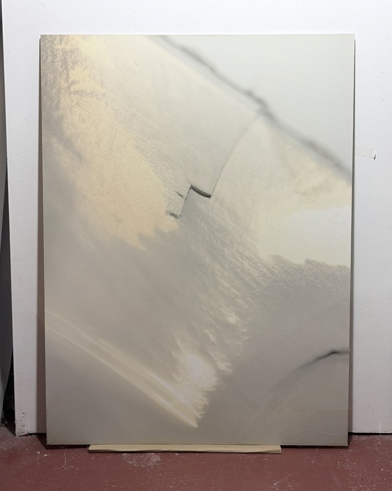
This one is from 2014, printed with support from a micro-grant at a certain university where I still work, and was actually used in court, as evidence of the multidisciplinary nature of adjunct work at that university, as part of an ultimately unsuccessful union organizing campaign
I started printing photographs of this material as cyanotypes in 2019. When photography was a new medium, the first photographic book was a work of cyanotype. It was an exhaustive project of close attention to the natural world, by a person who was treated as if she had no business doing science, and never considered what she was doing to be art. It wasn’t until the 21st century that her work was treated with the attention it deserved in the history of photography.
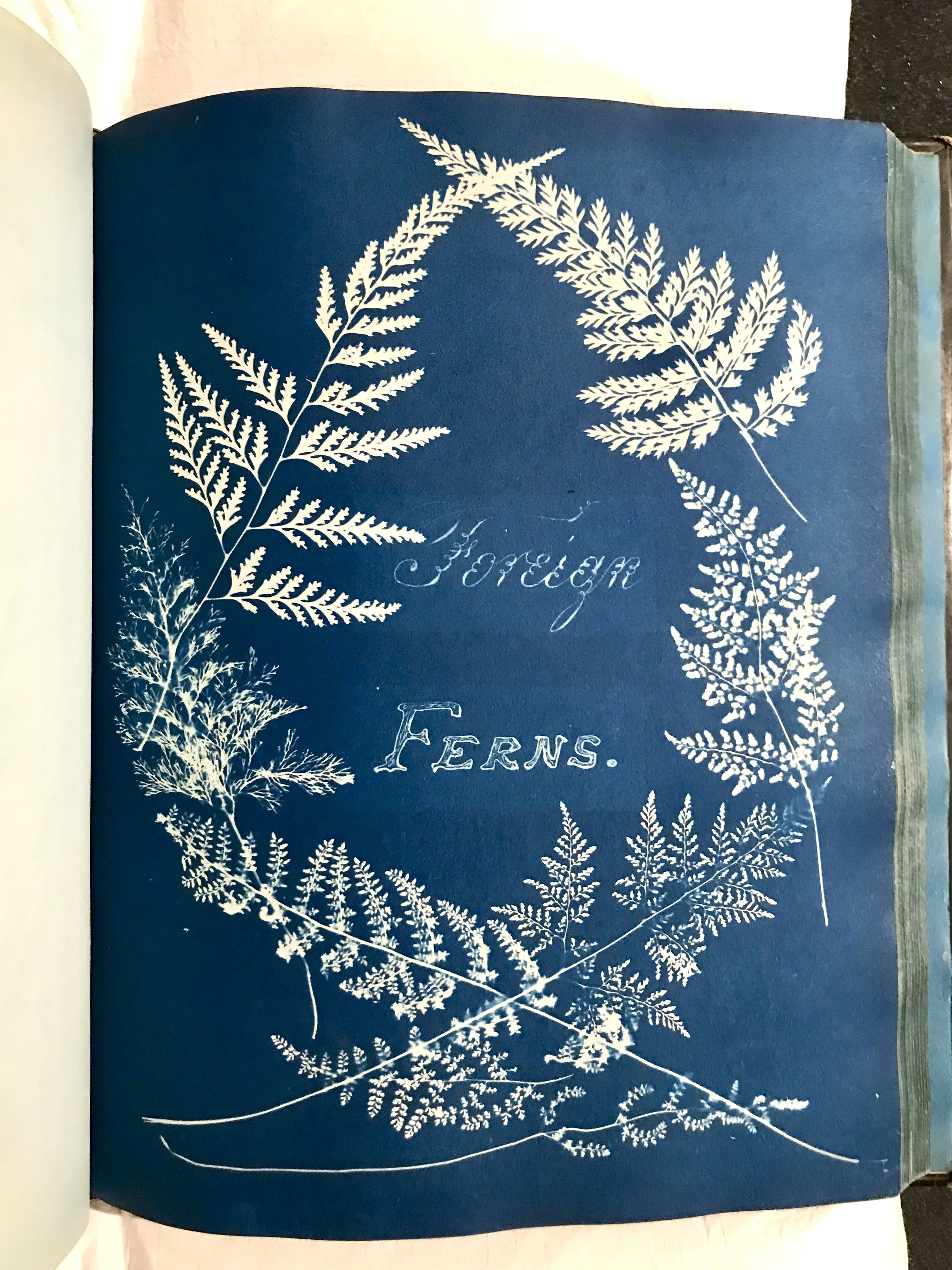
Anna Atkins’s British and Foreign Ferns, from the National Media Museum, Bradford . This was published in 1853, shortly after her more famous British Algae: Cyanotype Impressions.
Anna Atkins was devoted to the process of documenting life forms that were, in her lifetime, all being swept up into systems of classification. The way we name things structures how we see them. Her work was part of an age of discovery that was shot through with controversy, in ways that I think cast a meaningful light on where we find ourselves today.
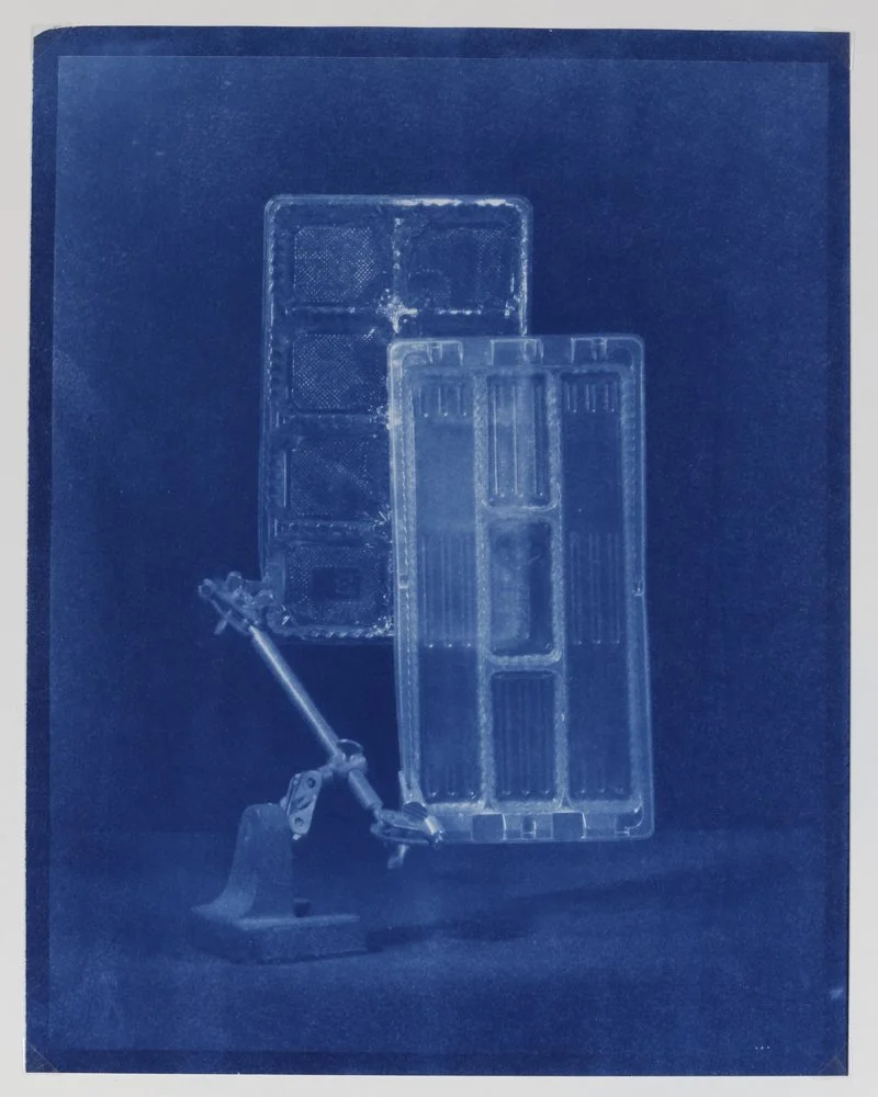
Around two years ago, Dan Hendrickson contacted me to ask if I would like to share some of this project in an exhibition he was proposing at Associated Artists of Pittsburgh. AAP is an artist-run organization that has been in continuous operation since the Gilded Age, and I’ve worked with them for a few years. I was excited about the opportunity to go larger with these prints. The times we’re living in have continued to change, and my feelings about this material continue to evolve. The show is all about contemporary uses of cyanotype as a medium, so with the knowledge that these would still be seen in the light of that history, the door seemed open to move away from that specific miraculous blue, with all of its implications. It felt like a good time to go a little darker with these.
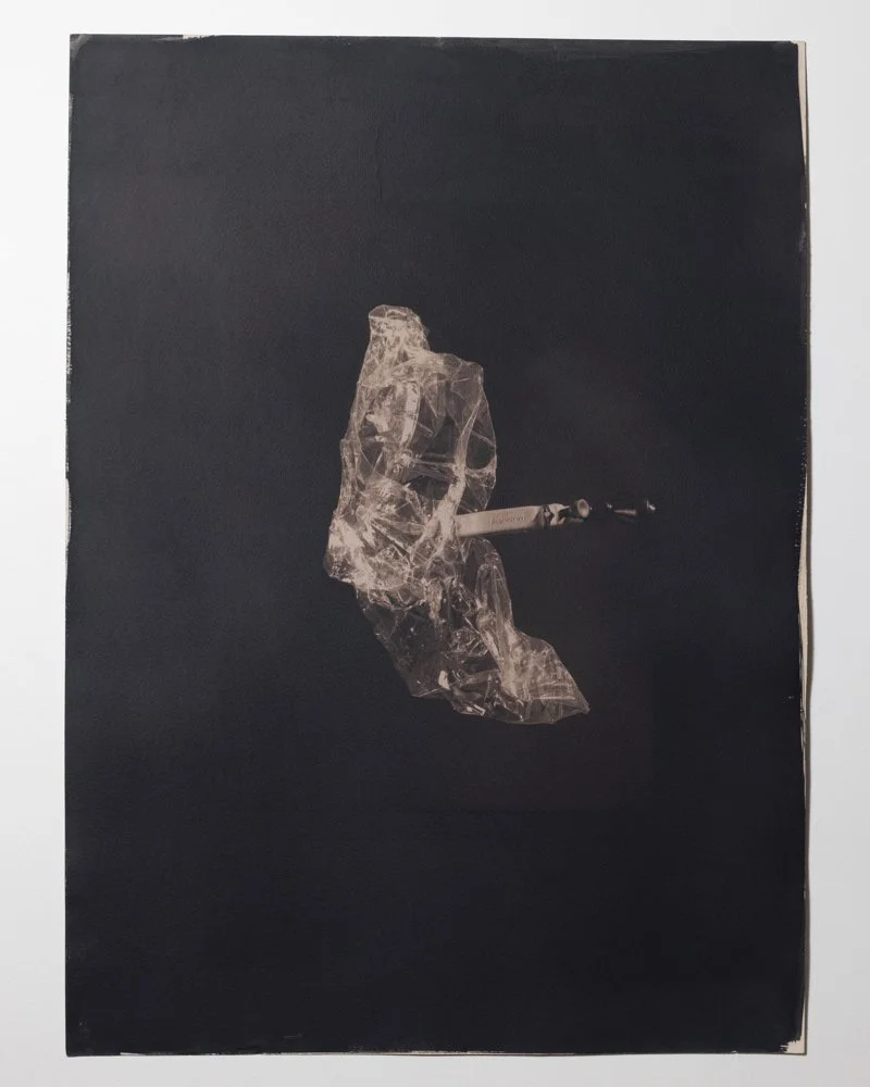
Where Facilities Exist (2452), toned cyanotype, 22” x 30”, 2019/2026
There are four prints from Where Facilities Exist in this show. Two of them are toned with wild strawberry leaf, which turns the iron in the prints to a dense, warm black. A similar tone is possible with the use of green tea, which is lucky for me, because my yard only had so much wild strawberry to offer. The prints have a lot of “art marks,” the kind of messy edges, spots, and tears that reflect the human aspect of this process. I think this is a good time to be putting things out there that look like a person made them.